
The Impact of Colors: Psychology of Colors in Hospital Design
Walk into two different hospitals and you'll probably feel two different things before a single doctor says a word to you. One might feel cold and sterile, the other calm and almost welcoming. That gap usually comes down to color. It sounds simple, but color choices in healthcare spaces actually shape how patients feel, how staff perform, and even how quickly people recover. Let's get into why hospitals are paying so much attention to this, and what the research actually says.
Why Color Matters So Much in Healthcare Spaces
Hospitals are stressful by nature. People walk in scared, in pain, or worried about a loved one. Designers and architects have started treating color as a real tool, not just decoration, to ease some of that stress. Color psychology extends to staff perceptions too, where a well-designed hospital with carefully chosen colors can boost morale, enhance job satisfaction, and foster better communication and teamwork among healthcare professionals.
This isn't a fringe idea either. A literature review on color psychology and hospital design screened over 3,000 titles using PRISMA methodology to pull together evidence on how color choices affect patients, staff, and the overall care experience. That's a lot of attention for something people often dismiss as "just paint." If you're planning a new facility from the ground up, this kind of detail usually gets folded into the broader hospital planning and designing process rather than treated as an afterthought.
The Science Behind Color and Emotion
There's a real biological basis for why colors affect mood. Warm colors tend to provide visual activation and stimulation, while cool colors communicate subtlety and relaxation. That's why you'll rarely see a recovery ward painted bright red, and why a children's play area might lean into brighter, more energetic tones.
Researchers studying paediatric hospital environments found something similar when looking at how different age groups and settings respond to color. Warm and vibrant colors, such as yellows and reds, were shown to uplift the mood of young patients in play areas, while softer pastels like blues and greens helped soothe patients and potentially aided pain perception in recovery rooms.
Cool Tones: Blue and Green
Blue and green show up constantly in hospital interiors, and it's not a coincidence. Based on previous studies, the consistent trend across populations is that blue and green are the most preferred colors. These shades are linked to nature, calm, and stability, which makes them a safe choice for patient rooms, waiting areas, and counseling spaces where lowering anxiety is the main goal.
Warm Tones: Yellow, Orange, and Red
Warm colors aren't avoided altogether, they're just used with intention. They work well in spaces meant to lift energy, like children's wards or staff lounges, but they're used sparingly in areas where patients need to stay calm, like ICUs or recovery rooms after surgery.
Evidence-Based Design Principles in Hospitals
This whole approach has a name in healthcare architecture circles: evidence-based design. Researchers like Roger Ulrich have spent years studying what actually makes a hospital environment therapeutic instead of just functional. Ulrich's research, along with later expanded reports, identified five design principles that contributed significantly to achieving therapeutic, patient-centered design goals essential for the psychological and physiological well-being of patients, families, and staff. You can read more about the original framework in the Norix whitepaper on humanizing behavioral healthcare facilities, which goes deeper into how these principles were developed.
One of those principles centers on bringing nature into the built environment, and color plays a direct role here. Nature can be represented literally or figuratively through natural light, water features, views of the outdoors, botanical imagery, natural materials like wood and stone, and colors that evoke the natural world. So when you see soft greens and earthy tones in a hospital lobby, that's not random, it's tied to a deliberate design philosophy meant to lower stress, the kind of thinking that usually shows up early in any patient-centered hospital design strategy.
Real Outcomes Tied to Color Choices
Here's where it gets interesting for anyone who thinks this is all just theory. Studies have actually tracked measurable outcomes connected to visual environment quality, including color.
| Design Factor | Documented Effect |
|---|---|
| Improved visual environment (including color) | Faster recovery rates, reported improvements of up to 10 percent in some studies |
| Wall color near patient beds | Studied for its effect on anxiety levels, pain medication requests, and length of stay in cardiac care patients |
| Color in pediatric environments | Linked to mood and emotional well-being in young patients during recovery and play |
| Color and wayfinding | Used to help patients and visitors navigate hospital layouts more easily |
The visual environment is described as a vital element influencing hospital staff morale and productivity, with studies even reporting that an enhanced visual environment produced faster recovery rates by as much as 10 percent, attributed in part to appropriate use of color in interior design. That's not a small number when you're talking about hospital stays, costs, and patient comfort.
There's also direct clinical research on this. A study focused specifically on wall color near hospital beds in cardiac care units looked at whether color affected patient anxiety. The study explored the impact of wall color at the foot of the hospital bed on patient recovery in a cardiac care unit, collecting data on anxiety levels, amount of pain medication requested, and length of stay. It's one of the clearer examples of researchers treating color as a measurable clinical variable rather than just an aesthetic choice.
Let’s Build Your Dream Hospital
Whether you’re planning a new hospital, expanding an existing facility, or upgrading your healthcare technology, Actiss Healthcare is here to guide you every step of the way. Let us help you turn your vision into reality. Contact us today for a free consultation & learn more about our services and how we can support your next healthcare project.

Color in Different Hospital Zones
Not every part of a hospital should look the same, and good designers know this. Different zones serve different emotional purposes, so the color strategy shifts depending on where you are.
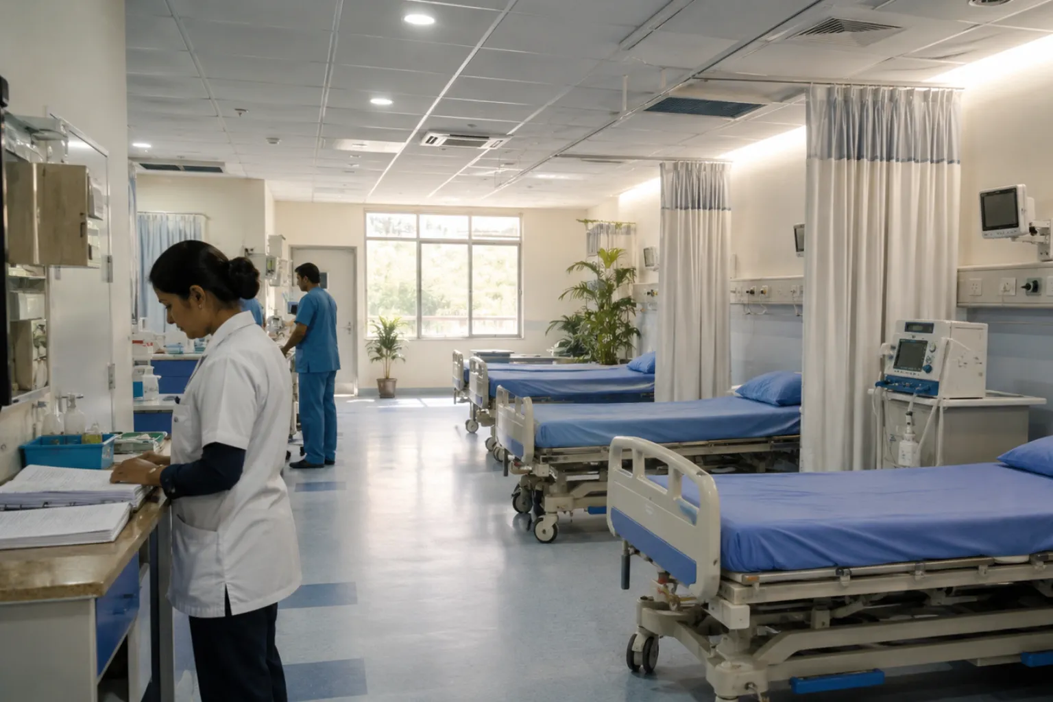
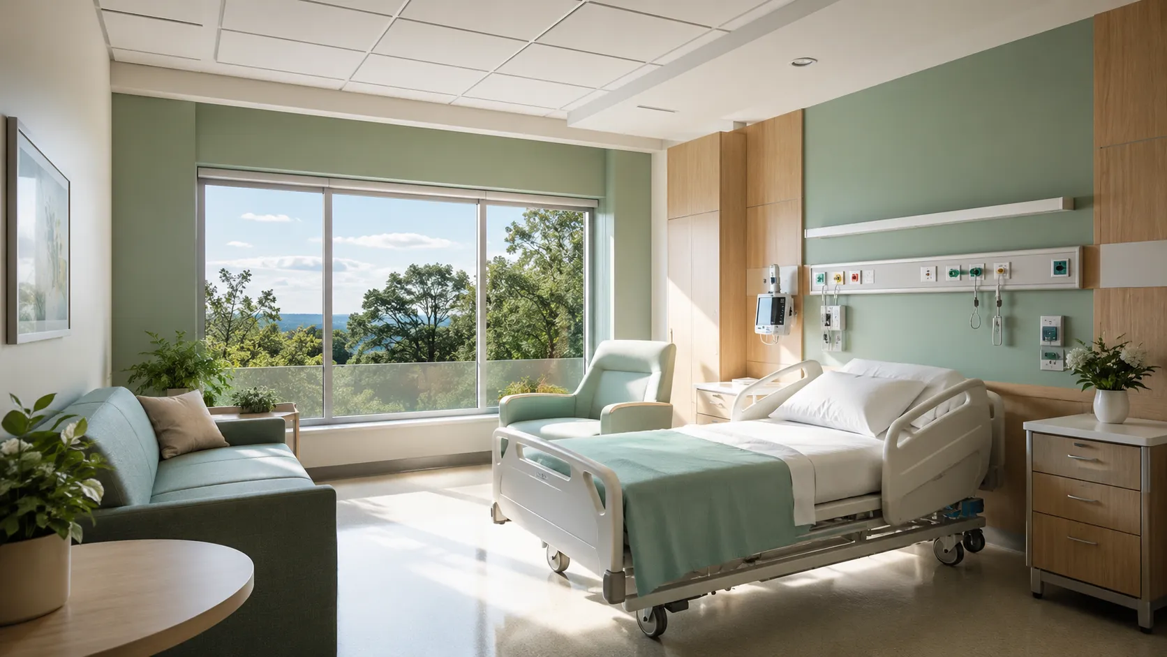
Patient Rooms and Recovery Areas
These spaces lean toward calming tones since patients spend long stretches of time here, often while anxious or in pain. Soft blues, greens, and neutral warm tones tend to dominate.
Waiting Rooms
Waiting is one of the most stressful parts of a hospital visit. Designers often use muted, comforting palettes here, sometimes paired with natural light and greenery, to soften the anxiety of uncertainty. This is also where good hospital circulation planning matters, since color and layout work together to keep people calm while they move through the building.
Pediatric Wards
Kids respond differently than adults, so play areas and pediatric wards often use brighter, more playful colors. Color choices tailored to children's unique needs have been shown to play a role in creating healing environments specifically for young patients.
Behavioral Health and Psychiatric Units
Color in these spaces carries extra weight because patients here are often more sensitive to their surroundings. Color is treated as a key interior design feature in this setting, with careful attention paid to how it affects mood, agitation, and overall comfort.
Staff Areas
It's easy to forget, but staff spend far more time in a hospital than most patients do. A well-designed hospital with thoughtfully chosen colors can boost staff morale, job satisfaction, and teamwork. Burnout is a real issue in healthcare, and the environment staff work in plays a role in that.
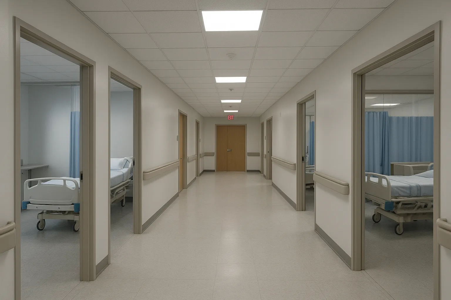
Wayfinding: Color as a Practical Tool, Not Just a Mood Setter
Color isn't only about feelings, it's also functional. Large hospitals can be confusing to navigate, especially for stressed visitors trying to find a specific department. Color is also a powerful tool for coding, navigation, and wayfinding, and it can promote a sense of well-being and independence for people moving through a facility. That's why you'll often see color-coded floors or wings, each one tied to a different department, making it easier for people to find their way without constantly asking for directions.
The Gaps in the Research
It's worth being honest here too. While there's a lot of support for the idea that color matters, the science isn't perfectly settled. Although existing literature underscores the importance of color in healthcare design, empirical evidence remains limited, and future research is needed to explore the nuanced ways color influences health outcomes and to develop clearer evidence-based guidelines. So while we know color matters, hospitals are still refining exactly how much, and in what specific ways, for different patient groups. This is one reason hospital owners often bring in outside expertise early, whether that's through a proper hospital feasibility study or ongoing hospital project consultancy, to make sure design decisions like these are grounded in evidence rather than guesswork.
Quick Comparison: Common Hospital Colors and Their General Associations
| Color | Common Use in Hospitals | Typical Psychological Association |
|---|---|---|
| Blue | Patient rooms, waiting areas, counseling rooms | Calm, trust, stability |
| Green | Recovery rooms, hallways, signage | Relaxation, connection to nature, balance |
| Yellow | Pediatric play areas, common spaces | Cheerfulness, energy, warmth |
| Neutral tones (beige, soft gray) | Lobbies, administrative areas | Comfort, neutrality, professionalism |
| Red/Orange | Used sparingly, often in accents or wayfinding | Stimulation, urgency, used cautiously |
Conclusion
Color in hospital design isn't a small detail, it's part of how patients heal, how staff hold up under pressure, and how everyone moves through a space that can otherwise feel overwhelming. Research backs this up again and again, from studies on cardiac patients to reviews covering thousands of sources on healthcare environments. Blue and green show up everywhere for good reason, warm tones get used carefully where energy helps, and wayfinding colors quietly make hospitals easier to navigate. The science still has gaps, and not every claim is fully nailed down, but the overall pattern is clear: thoughtful color choices genuinely make hospitals feel like places meant for healing, not just treatment.
Let’s Build Your Dream Hospital
Whether you’re planning a new hospital, expanding an existing facility, or upgrading your healthcare technology, Actiss Healthcare is here to guide you every step of the way. Let us help you turn your vision into reality. Contact us today for a free consultation & learn more about our services and how we can support your next healthcare project.
Frequently Asked Questions
1. Why do hospitals use so much blue and green?
Blue and green are consistently shown to be among the most preferred colors in healthcare settings, largely because they're associated with calm, nature, and stability, which helps reduce patient anxiety.
2. Does color actually affect how fast someone recovers in a hospital?
Some studies have linked improved visual environments, including thoughtful color use, to faster recovery rates, with reported improvements as high as 10 percent in certain research.
3. Why are children's hospital wards often more colorful?
Children respond differently to color than adults do. Brighter, warmer tones like yellow are often used in play areas to uplift mood, while softer colors are used in recovery spaces to help with comfort.
4. Is color only about mood, or does it serve other purposes too?
Color also plays a practical role in wayfinding. Hospitals often use color-coded zones or signage to help patients and visitors navigate large, complex facilities more easily.
5. Does color in hospitals affect staff, not just patients?
Yes. Thoughtfully chosen colors have been linked to improved staff morale, job satisfaction, and better teamwork among healthcare professionals who spend long hours in these environments.